Our finished Music Video

My Outside Digipak Panels

My Outside Digipak Panels

My Inside Digipak Panels

My Inside Digipak Panels

Please click on the image below to view our finished website

Saturday, 23 December 2017

Construction Post 6: Website Post Production

We used the website builder 'Wix' to design and create our website. None of us had ever used Wix before so there was a lot to learn but I think that by the end of the process I had become quite comfortable using it. 

An artist's website is the hub for all of the information about them. It is also a good place for fans to be able to buy merchandise, find out about tour dates and opportunities to meet the artist. We also wanted to include interactive content such as social media details and competitions so that audiences can get involved. 

Home Page
Below is a photo of our home page with annotations of each feature.
Our homepage was a scrolling home page and as the viewer scrolls down they will see the new music video, a sliding photo gallery and also the live social media feed. Having the social media feed at the bottom of the page was inspired by Jason Derulo's website where there is a section dedicated to social media at the bottom of every page.
Our social media section and Jason Derulo's social media section
Some audience feedback during the process of making the website was to put social media in the header of the website as well so it is right at the top of the page and not only in the footer. This was to ensure that viewers will see it straight away instead of having to scroll all the way to the bottom of the page.
Before: No social media in header

After: Social media icons added
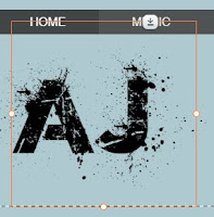
In addition to this the AJ logo was covering the Music button in the navigation which meant once the website was published the Music page couldn't be accessed. To fix this we had to resize and re-position the logo so that it wasn't overlapping.

Before: The Logo is covering the Music Button
After: No Overlap of the Logo
In our footer we have made sure to include copyright information, terms and conditions and also privacy policy information. These link to Atlantic Records pages as they are the parent company for our record label. In addition we have social media links as well.
Footer from the home page
Music Page
On our music page we had our music video at the top as it is the latest release for AJ and also his debut single. In addition to this we have a music player underneath which is set up to play all of the songs from the Disclosure album, as well as giving the opportunity for fans to buy not only the album but individual songs as well. 
The website is also designed to take you to PayPal when someone tries to buy a song/the album.
Tour Page
Our tour page contained all dates and venues for AJ's upcoming UK Arena Tour. Below is a screenshot of the table I made with the dates, venues, locations and ticket buttons. Each one of the 'Tickets' buttons takes the audience to the Ticketmaster homepage. 
About Page
The first thing that the viewer sees on our About page is a quote from NME magazine. NME is a British music journalism magazine and so this would appeal to audience members who have a strong interest in music. 
In addition to this we have included an interactive Q&A where fans can slide through a range of questions and read AJ's answers. This allows for the audience to get to know him better and build more of a connection with him and his music.
Gallery Page
Me editing the Gallery Page
The gallery page consists of photographs of AJ - promo shots and also some behind the scenes photos. There is also a behind the scenes video which allows for the audience to see exclusive content of what happened during the shoot and some fun bloopers.
Photos
Behind the scenes video
Shop Page
Me editing the Shop Page
On our shop page there are 12 products that fans can buy. From looking into other music artists we picked items that were commonly sold as merchandise and made sure to Photoshop the AJ logo onto each item. 
Our 12 items of merchandise
Once an item is clicked the viewer is taken to a page where they can choose the size and/or colour of the item and also read the product information and refund and return policy before adding the item to their cart. There is also a quick view option where you can choose size, colour and add to the cart without reading the extra information.
Quick View of Products
Detailed View with Extra Information
News Page
Our news page contains all of AJ's upcoming events, for example the UK Arena Tour and a radio appearance. Below is a photo of some of the events on the news page. 

Events on the News Page of the website
The competition has a read more button which when pressed takes you to the page below
We found that this was interactive for the fans as they could get involved directly and also get the opportunity win something. We also have it sponsored by JD Sports as we felt that a British clothing company would be most likely to sponsor AJ as most of his fans are also in JD Sports target audience of teenagers and young adults. 

At the bottom of the page we also have a subscribe option where fans can enter their email address and stay up to date with all of AJ's latest news.
Subscription option
Audience Feedback
We received positive feedback about our website. Some key points have been mentioned below
  • People really liked the different backgrounds on each page and felt the photographs were all really good quality 
  • The behind the scenes video was enjoyable to watch
  • The clear colour scheme of black, white, greys and blues was consistent and looked good.
  • They really liked how the ticket buttons took you to Ticketmaster and the shopping options took you to PayPal
  • In addition they liked the range of merchandise available and said it was very realistic
  • Overall the website seemed easy to use, clear and accessible as well as being interactive for the users
Ultimately, I am very pleased with how our website turned out especially because we started from scratch on a software we had never used before. I feel that it looks very professional and I think that it acts as a hub for all of our products and information successfully. 

Construction Post 5: Digipak Post Production

To create our Digipak album cover we used Adobe Photoshop. Below is the template we used for the front and back outside panels. A similar template was used for the inside panels too.
Outside panels template
Outside Panels
Below is a picture of what our final outside panels looked liked.


Outside Panels
The back cover doesn't match our original flat plan as the layered effect we were trying to create didn't work that well. 
Our Flat Plan
As a group we decided to change our idea to something more simplistic yet striking. We spoke to our target audience about the layered photo and our substitute photo and they preferred the substitute photo we chose and said that it worked well with the front cover and looked more slick and sophisticated. 
Before: Our layering attempt
After: The substitute idea we used
I added the album title, artist logo and the song names as well as adding some effects to the main photo of AJ on the front cover.
Me editing the front cover of the album
To create the album and song titles and also the artist's name we had to download two new fonts called World Conflict and Questrial-Regular. We chose World Conflict for the artist's name because we really liked the edgy, street feel the font had and the fact that it looked like spray paint, adding to the street art, gritty vibe we wanted for the album cover.
World Conflict font preview
We chose a simple font like Questrial for the album title and song names because we wanted it to look classy yet sharp but not distract too much from the photo of AJ on the front because it is a debut album and we wanted to focus on introducing AJ as an artist.  To really make the words stand out I used Blending Tools to add shadows to the letters, helping them stand out more and giving them more shape and dimension instead of looking flat.
Questrial font preview
We chose grey, grungy backgrounds for both the front and the back because we were going for something simple yet effective. We felt that this really followed genre conventions of having a plain, one-toned background, similar to existing covers such as Jason Derulo, Mary J Blige and our inspiration for this panel Amy Winehouse.
The background we were inspired by
One the back cover we had to ensure that we had all the institutional information like the artist website, record label logo and a barcode as well as all the relevant copyright material so that we were following album cover conventions.
Inside Panels
Below are our inside digipak panels
Inside Panels
Our inside panels consisted of a side profile photo of AJ's head filled with the words that describe what the album means to him as well as words that represent his personality as it is his debut album and we wanted this to show who AJ is as a music artist. This album is AJ's way of expressing his emotion, his memories and his problems. The aim of this was to give the album a more personal touch and make it meaningful which would hopefully make it more relatable to the audience.

The right hand panel where the CD would be only consists of a simple, graded photo of the back of AJ's head as we didn't want anything too distracting or bright as that wouldn't fit with the rest of the album. We also didn't want to put something meaningful like the collection of words as it would be covered by the CD. 

We went with this image as we felt it worked really nicely with the other three panels. The photo ended up black and white which gives it an almost vintage, old school feel about it. This is effective for our album cover as the genre is contemporary R&B but we wanted AJ to be able to bring back the old school, traditional style of R&B music in this album. 

Audience Feedback
After speaking to members of our secondary audience (people aged 12-25) I have collected to following feedback about our final digipak cover.
  • The colour scheme and dark, grungy theme works really well and they like how is consistent across all four panels
  • The logo is a really cool font and looks very artsy and edgy at the same time
  • The photograph on the front cover is really effective and the lighting works really well
  • The institutional information adds a more professional, realistic touch
  • Some people did not easily recognise it as an R&B album cover

Overall I am really pleased with the outcome of our final digipak. I have really enjoyed editing the photos and putting it all together and I love the style and theme of the final product. My personal favourite panel is the inside left as I love the concept of the words inside his head and the words themselves as I feel it adds a personal touch to the album and for me that links to what music is all about - expressing yourself. 

Construction Post 4: Music Video Post Production

Editing our music video
To edit our music video we used a software called Adobe Premiere Pro. We started the process by renaming all of our shots and placing the lip-syncs on the tracks. We then made sure to sync all of the lip-syncs at the start to make the editing process more efficient and to save time later on. 

We decided to share the responsibility of editing the video, making the website and making the digipak equally between as so that we could all contribute to each ancillary product. My main contribution in editing was renaming the shots, matching some of the lip-syncs and putting the shots on to the timeline, in particular the solo dance, some of Laith's lip-sync and the narrative montage of Sian and Adam.

One of our revisions we decided to make from the test edit was to make sure our shots didn't cut from mid shot to mid shot and instead we needed more extreme changes in framing to follow music video conventions. Below shows one of our changes from a long shot to a MCU to a mid long. 
We had a clear vision as a group about how we wanted to style and grade our video, keeping it quite simple, desaturated with a lot of blue and grey tones. To ensure this was consistent throughout we had to grade the narrative shots so that they were black and white because they stood out a lot in colour compared to all of our dance and lip-sync footage.
Comparison of the narrative shots in colour and in black and white
We also added fades in between shots to make the transitions smoother and also to match the pace of the song. I really like the addition of the fades that we didn't have in the rough cut as it added to the style of the video. We were inspired by Ne-Yo's video for 'Closer' 


We also had a camera quick pan which acted as a transition between two shots which I was responsible for editing. As a group we are really pleased with this shot as it looks very clean and effective. To do this we had to ensure the timing of each shot was correct so that the pan from the first blends into the pan from the second. One thing that helped the edit of this to be effective was the fact that when Sian filmed each shot her hand moved at the same speed each time. This consistency meant that the two shots merged well together.


After getting some feedback from our teacher who felt that the cuts were slightly boring and not edgy enough, we decided to add some quick cuts in certain sections like the narrative argument and also the talking at shots. I felt that this was really effective as it not only shows the development in the argument but also helps to represent the anger and emotion in the lip-sync.

When it came to editing our dance break we came across a few issues. Reviewing our rough cut we found we definitely needed more cuts to different angles as it felt quite stiff and boring. In addition to this we decided to add extra shots of Sian and myself doing the group dance so that we could cut from the boys to the girls in a similar way to Ne-Yo's 'Miss Independent' video.
To add to this further, we also created an effect called ghosting to the dance break. Sian was the one who added this and she did it by layering the footage on two tracks, one clip starting a few frames later. This made the dance break look really edgy and less static and we were really pleased with the final outcome of it.
Audience Feedback
Once our music video had been completed we asked members of our primary target audience (R&B fans) and our secondary target audience (people aged 12-25 years old) for their feedback.

The overall response was very positive and the shots that were the most liked were our back lit silhouette dance shots. In addition to this the shadow shots with Sian and Adam whilst Laith was lip-syncing were also liked as well as the black and white narrative shots. Many people felt that the black and white grading was effective as it matches the performance shots well and fits the overall style. The narrative was clearly developed and our audience could follow the story well, and felt that the narrative helped to link the visuals to the lyrics giving the song more meaning.

In addition to the music video, I also edited a behind the scenes video that we can use on our website.
Below is our final music video.
Overall I really enjoyed the editing process of our music video as it was really fun to look back at all our footage and be able to create something that looked really professional and effective. I managed to develop my editing skills further as well as get the opportunity to be creative with some of our cuts and transitions. We worked well as a group and managed to produce a music video that we are all really pleased with.

Sunday, 10 December 2017

Construction Post 3: Week 3 Production

Our third and final week of production consisted of carrying out our promotional photo shoot. This was done in school with a white backdrop and lighting system set up

Our set up for the promo photo shoot
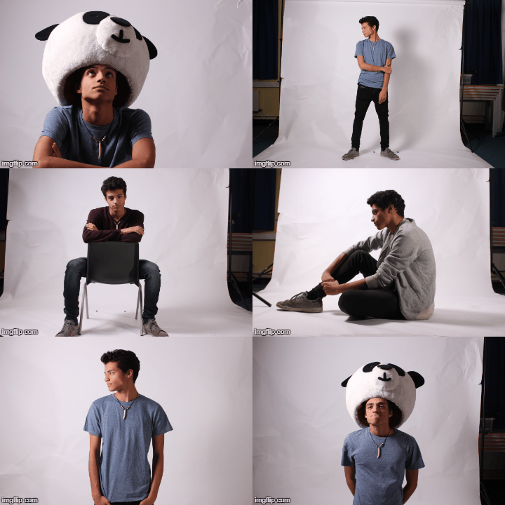
During this we had 4 photo shoot sessions, one practice shoot and three main ones.We planned these shoots in the practice by making a list of all the poses we definitely needed and also a range of potential costumes. In the end, Laith had 5 different costumes which meant we would have a range of different photos. Below are some of our photos.
 
I was responsible for directing Laith during the shoot as well as taking some of the photos. I also changed the lighting for different shots. I really enjoyed the photo shoot as I loved using all the new equipment, in particular the lighting kit.
Me adjusting the lights
Me taking some of the photos


Below are some of my favourite promo shots and their inspiration.
Promo shot inspiration
Overall I really enjoyed our promo photo shoot as it was a new experience and really fun to do. I feel that we have a range of photos that can be used effectively on our website, social media pages and digipak album cover. 

Construction Post 2: Week 2 Production

Our second week of production consisted of our main shoot week. This took place in school in the studio and also on location for one day.

We had a schedule for our group to show who would be in the studio during the week at each time. This helped us to create a call sheet, shoot-board and shoot schedule so that we all knew what was happening each day and who would be required in terms of our extra actors. It also meant we had a goal for each day to make sure all the footage would be filmed.

Below is a copy of our group schedule.
Monday
Monday's Shoot Schedule
On Monday we had planned to film some of our lip-syncs, my dancing shots, Sian's dancing shots and also some of the boys group dance shots. However we spent most of the morning trying to set up an infinite white background so you can't see the join between the floor and the cyclorama. However we tried A4 and A3 sized paper and neither worked effectively. It was clear that it was paper being used and as a group we decided that it was best we didn't have it. Below are some photos of the cyclorama and the paper we tried to set up.

After this setback we had gotten to lunch time and we decided to spend it rehearsing with the boys for their dance shots. This was productive as it meant that during the after-school session we knew exactly which moves we were filming and all the boys had been reminded of the choreography and so no time was wasted. We were able to film the dance scenes from a variety of different angles with different framing so that when editing we could cut between them in order to make it more interesting. Sian and I took turns filming and directing this section.
Me filming one of the group dance shots
Tuesday
On Tuesday we planned to film our lip-syncs and also get the shadow shots and talking at shots done, all of which required different lighting and the talking at shots required a different lens.

Below are some screenshots of each of the set-ups
Tuesday's Set Ups
We started with the flicker lipsyncs as that required all three of us to be there. For these shots, Laith was acting, Sian was using the reflector and I was filming and directing Laith's performance.
Laith performing, Sian using the reflector and myself filming the flicker shots
Next we filmed the shadow shots which required Adam, one of our extra actors. This took a while to set up as the floor lights had to be in the correct place in order for the shadows to appear the right size and colour. As Laith, Sian and Adam were all on camera, I was responsible for filming and directing the shots. One thing I had to make sure to keep an eye on was that Adam himself stayed out of frame and that only his shadow was seen. Once we were all set up, the lip-syncs themselves ran smoothly and we got many good takes. 
This was one of my favourite shots to film as we found that it worked really well and looked really good on camera.

We spent the afternoon filming our handheld shots. Whilst I was there I helped Sian to film by cable bashing behind her to ensure she didn't trip over the wires whilst she was walking around.

After school we focused on the Laith talking at Sian sequence. We made sure to film it on both sides so that we could cut between them during editing. I was responsible for filming and directing again for these shots. I had to make sure that Laith stayed in frame and that they both varied there movements so we could get a range of shots. We had been inspired by Skylar Grey's song 'Back From the Dead'.
Sian and Laith Performing

Inspired by 'Back From the Dead' by Skylar Grey
In order to make up for the missed time on Monday we also did some more flicker lighting lip-syncs in a range of framing.

Wednesday
On Wednesday we were faced with another problem. When setting up the equipment in the morning we found that the camera we had been using wasn't working and so we were unable to film with it. However we were fortunate enough to be able to get it to a repair shop and have it fixed by the start of the next day.
Me helping Laith with his dance performance

We were given a replacement camera (the Canon Legria HFG30 Camera) to continue our filming however as the two cameras are so different in quality and design, our lighting didn't appear the same on the replacement camera and decided to adapt and use our time differently instead of filming as we didn't want some of our footage to look incredibly different to the rest we had so far.

As we were unable to continue filming, we used our time productively and planned out the next three days in detail so that we could still finish on time and to make sure we still managed to get all of our shots. We also rehearse and choreograph Laith's solo dance shots as we needed to make sure we had a set of moves he could perform and so we could film them straight away without wasting time the next day.

Thursday
By Thursday, the camera had been fixed and we could resume filming. We focused on dancing as we hadn't had a chance to film it so far. We managed to get Sian and my own solo dancing filmed and aslo some of our duet dancing filmed. This said optional in our schedule as we thought we might have got those shots by Thursday however we had to use it to film as we missed out on Monday and Wednesday.
Filming my dance shots
We also filmed the majority of Laith's solo dancing after practicing for most of Wednesday. We did this using both the silhouette lighting and also the spotlight. We did multiple takes of each move so that we had a selection to choose from. I filmed and directed Laith's dancing and made sure to be encouraging and supportive as Laith had learnt to dance for this shoot and I didn't want him to feel uncomfortable.
Laith's solo dance set ups
After school we filmed some more flicker lighting lip-syncs, however the camera's ISO setting must have changed as the footage appeared very bright on camera. We also filmed the reverse of the talking at shots and this time had Sian talking at Laith. In the same way as before, I was responsible for filming and directing these shots as I wasn't acting in them.
Sian and Laith performing the reverse talking at shots
In addition to this we filmed the shot of Laith walking into frame from out of focus to in focus. To do this, along with the talking at shots, we had to use a different camera lens. This lens had a much shorter depth of field and so we could really experiment with the focus in our shots. This worked really well for when Laith was walking forward. In terms of the talking at shots it meant we could focus on the person on the outside who was talking.

Friday
On Friday we continued filming Laith's dance shots in the morning as well as adding some more flicker lip-sync shots as we felt we needed to re-do them after watching the footage back from Thursday as Laith appeared really bright in the footage and it didn't match our other takes.

Sian and Laith also filmed their dance shots together on this day, using the same silhouette lighting as the group dance.
Sian and Laith's back lit dance

Sian and I doing the guys dance
At lunch we had another session with our dancers and so we continued filming their sequence from a range of angles. Sian and I also filmed our version of the boys dance so we could cut between it in the dance break

In the afternoon, as Sian and I had filmed all of the dance shots, we decided to use the time to look through all of the footage we had filmed and make a note of anything we didn't like or wanted to change as we still had an after-school session and Saturday morning. Below is our list of changes.

Saturday
On Saturday we continued to re-film the shots we need to improve in the morning, including Laith's solo dance scenes and some of the hand held lip-syncs and also flicker lighting lip-syncs.

As we didn't need to redo any of the screen shadow shots we used the time to continue filming a range of hand held lipsyncs. 
The final studio session was with the boys in the afternoon to film the remaining dance shots. This consisted of their choreography for the dance break and also the smaller moves in between, such as this leaning back shot which can be seen below.


Sunday
Our priority on Sunday was to film all of our narrative shots as we had filmed the lip-sync the weekend before. Below is a sample from our Narrative shoot-board.
We decided that we would film all of the shots which required Adam, our extra actor first. These shots consisted of a serious of different shots both in my neighbour's house and in the park. Laith and I took turns directing and filming these shots as he hadn't had a chance to film anything throughout the week.

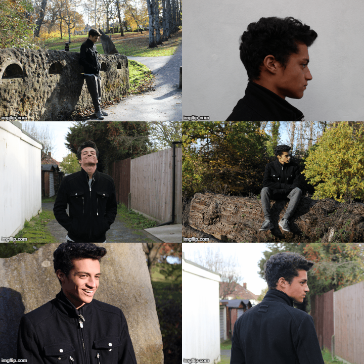
Whilst in the park we also took the opportunity to take some of our location promo shots using my digital camera (a Canon EOS 100D).

Once we returned back to my house we filmed all of the outdoor shots first. This consisted of the narrative shots of both Sian and Laith by the wall outside. I was responsible for filming and directing this. In addition to this shot, I took some more promo shots of Laith outside in the alley way as can be seen below.

Our final part of filming took place inside, where we filmed the rest of the narrative shots between Laith and Sian. This consisted of the argument sequence, the sofa shots, the phone shot and the mirror shot. As Laith and Sian were acting in both, I was filming and directing these most of these shots but Sian also filmed the ones she wasn't acting in.
Some of the shots I filmed
Overall I feel that our studio shoot, despite being quite eventful, was really enjoyable. By the end of the shoot I can definitely say I was very comfortable and confident using the lighting desk and changing the position and colour of the lights. In addition to this I have gained confidence filming hand-held shots as I had never done so before. I would say that the week was successful and we managed to film all of our shots even with the issues we faced. All three of us worked really well together and had a fun and memorable experience.
Behind the Scenes Group Photo