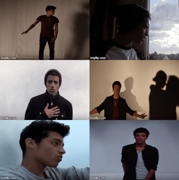
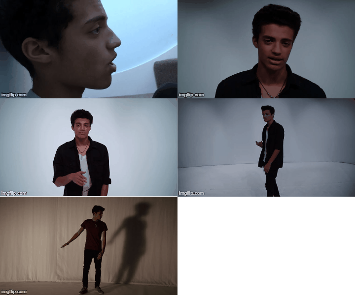
Our finished Music Video

My Outside Digipak Panels

My Outside Digipak Panels

My Inside Digipak Panels

My Inside Digipak Panels

Please click on the image below to view our finished website

Thursday 4 January 2018

Evaluation Question 1: In what ways does your media product use, develop or challenge forms and conventions of real media products?

Our media product as a whole - the music video, the album cover and the website - use, develop and challenge forms and conventions of existing media products in a variety of ways which I will explain below. We followed and developed conventions in order to create authentic media products and we challenged some conventions in order to make them stand out.

Our Music Video
The purpose of a music video is to help promote the song and the album and also to create an image for an artist. Our music video is to 'Cry Me A River' which is a contemporary R&B song and it is AJ's debut single. Through the music video we want to show that AJ is recovering and moving on from a break-up, which is relatable to many people.

According to Simon Frith's theory of music videos, there are three main forms of music videos: Conceptual, Performance or Narrative. 
Forms of Music Videos
We applied this theory by having a combination of performance and narrative in our music video. 

Narrative
Our music video's narrative has a basic structure. AJ is looking back on his relationship with his girfriend which ended because she cheated on him and the song is about him expressing how he felt about it and how he is moving on. The narrative is set in the past and consists of fragments of his memory that have impacted him the most, for example the happy memories of when he was in love and also the painful memories of the arguments and the discovery that his girlfriend cheated on him. 

Carol Vernallis' theory states that music video narratives may be fragmented and make the structure of the music video disjointed. 
Our narrative scenes are placed in between the performance, in a similar way to James Arthur's music video to Safe Inside which can be seen below. In addition to this, James Arthur's music video's narrative is also based on past memories whilst the performance aspect all takes place in the present.

Vernallis also says that a narrative may pose questions that it doesn't answer and that there may not be a clear resolution. For example in Amy Winehouse's music video for Back to Black questions are raised from the beginning as the first narrative shot is of a group of people all dressed in black next to what seems to be a funeral hearse which raises questions like "Is that a funeral hearse?" and later as it becomes clear that it is a funeral the question of 'Who was it that died?' is raised. 
I feel that our narrative does raise questions such as 'Why does she cheat on AJ?' and 'Who is the other guy?'.

We also applied another part of Vernallis' theory in our narrative and this was discontinuous editing, which can be seen in our mini-montage when AJ's girlfriend is cheating with the other guy and also during the argument as we used jump cuts to create a disjointed, shaky style. 
Performance
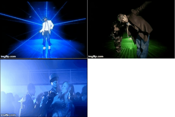
I think that our video is more performance heavy than narrative as it contains a large amount of lip-sync and a few dance shots. Our main inspiration for our performance sections came from R&B artists such as Ne-Yo, Jason Derulo and Usher.  
This video is primarily performance which was really useful when looking at how to film and edit our performance sections. We noticed that different set-ups and costumes were used throughout and so we made sure to include a variety of set-ups, lighting and costumes as seen below.
In addition to this, we made sure to film AJ's lip-sync from different angles. This helped us to both show AJ as a strong, confident character when he was directly addressing the audience, but also we got to portray his more emotional, vulnerable side when he is looking off camera. In these shots we really tried to convey AJ's sadness through facial expressions and actions. 
Lip-syncs from the side and direct
Inspiration from Jason Derulo in 'Secret Love Song'
There was a lot of variety within these shots as we filmed with a range of different framing which can be seen below. 
 
Andrew Goodwin's theory suggests that there must be a link between the lyrics and the visuals of a song. We followed this theory in our music video by picking out certain lines and making sure AJ's actions match the lyrics or by making sure the narrative matches whats being said. Examples of this are the line "Why did you leave me all alone?" where we see the girl walk out on AJ and also the line "I found out from him" where we see AJ point to the shadow of the other guy. 
Genre
Goodwin also suggests that a music video must convey a sense of genre. We did this by following and developing R&B music video conventions. Below is a mind-map explaining how we used, developed and challenged conventions of the genre. Please press play in the top left hand corner to go through it. The speed of the presentation can be adjusted in the bottom right hand corner.

Our Website
Below is a prezi explaining how used forms and conventions in our website.
Our Album Cover
Below is an Emaze explaining how used, developed and challenged conventions in our album cover. 
In conclusion, I feel that we used and developed forms and conventions of the real media products we researched in order to successfully create a genuine product which also stands out due to the conventions we challenged, making it unique in comparison to what is already out there in the music industry.

Wednesday 3 January 2018

Evaluation Question 2: How effective is the combination of your main product and ancillary texts?

All 3 of our products (the website, music video and album cover) were combined to create a successful marketing campaign that would reach and appeal to our target audience. It was essential that the campaign was synergistic in order to promote AJ's brand identity.

The aim of the music video is to raise awareness of the artist and promote the release of the single, which in turn promotes the album. 

The album provides audiences with a physical copy of more of the artists songs. However in the modern age album are becoming less prominent with the rise of streaming and online music services. The album also works to promote the tour, as tours are usually named after the artist's most recent album, which is the biggest source of revenue. 

The website acts a hub for all of the artists information. It is also used to promote the record label, tour ticket companies, music purchasing sites and merchandising retailers. The website should also meet the needs of the audience and be fun and interactive.

Marketing and Synergy
From researching into different artists, I decided to look in Kelahni's marketing campaign. She is an up-and-coming young R&B artist who has just released her debut album. In addition to this she is signed to our record label's parent company - Atlantic Records - and so this would help make our campaign as realistic as possible. 

Below is a diagram breaking down her marketing campaign.
Timeline of Music Video Releases, Performances and Album Release
How the website works with Kehlani's album and merchandise promotion
Using this as inspiration we tailored our three products in order to create a successful marketing campaign. 

Marketing theory also references the 4 Ps that form the marketing mix: Product, Place, Price and Promotion. We applied this in order to create a marketing campaign that is effective and appealing to our target audience. 
  • Product: We created three products, one of which is available for purchase. These products will be available for the audience to enjoy and generate their interest. 
  • Place: All of the products are online and given the increase in the use of Web 2.0 and the huge impact of social media this is the best place for our products as it has a wider reach and attracts the youth audience which is a large portion of the music listening demographic.
  • Price: Our merchandise is being sold at affordable prices and is cheaper than some existing products meaning that people will be more attracted to buying AJ merchandise. 
  • Promotion: Our website promoted both the music video and the album. The music video promoted the album also. We also had events promoting AJ as he is a new artist including a Meet and Greet in Westfield Shepherd's Bush. 
Star Identity
Richard Dyer's Star Theory suggests that a pop star has an identity not just restricted to their music. Below I have created a mind map in order to explain how we applied Dyer's Star Theory when constructing AJ's image. 

Website and Connectivity
Below is a Prezi that I have created in order to show how our website acts as the hub for all of our products and how it connects them all together as well as being able to connect the audience to AJ himself. 
Ultimately I feel that our three products work really effectively together and are successful in creating a realistic marketing campaign. They also work well to create a brand image for AJ that is appealing to our target audiences. 

Evaluation Question 3: What have you learned from your audience feedback?

When creating any media product it is essential to organise and reflect on feedback from members of the target audience in order to ensure that the product is appealing to the potential consumers. We received feedback throughout the construction of our music video, album cover and website and also on the final products. Below I have analysed the responses we got from our audience feedback. 

Our Target Audience
  • Primary Audience: Our primary audience consists of fans of R&B music (both modern and old school R&B) as these would be the people who are willing to buy and engage with the music. We did not limit this by age or gender. These people are likely to be fans of other artists like Rihanna and Jason Derulo or old school artists such as Diana Ross or Luther Vandross.
    Primary Audience 
  • Secondary Audience: People aged 12-25 as this is the biggest age demographic of music listeners. In addition to this AJ can act as a role model and inspiration to younger listeners. Most likely to stream music online on Spotify or YouTube or buy online from iTunes.
Secondary Audience
  • Tertiary Audience: Fans of mixed genres such as pop and R&B or hip hop and R&B as they are likely to enjoy the style of music that AJ makes. They may listen to radio shows such as Capital FM or Kiss FM.
Tertiary Audience
Appealing to our Target Audience
Below is a prezi explaining how we applied the Uses and Gratifications Theory in order to appeal to our target audiences. 
Music Video Feedback
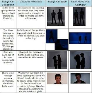
We received feedback after our rough cut and also throughout the process of constructing our video. Below is a table of the feedback we received from our rough cut and how we responded to it for the final product. 
Table of feedback and changes
In addition to this we showed friends and family the video at its halfway stage and asked for feedback. Everyone really liked in - especially the dance silhouette shots. People also really liked the fades between some shots and so we made sure to include more of them in the rest of the video. 

Once the video was finished and uploaded to YouTube we created an online survey using Survey Monkey. This was linked to the music video on YouTube and also sent out to our friends and family. This meant that we were able to get feedback from a range of different people who weren't necessarily part of our target audience. 

Here is a link to our survey.
https://www.surveymonkey.co.uk/r/K5SLH62

Below I have analysed some of the responses to the survey. 

This bar chart shows that the most common age group is 16-24 year olds which was really good as it meant that we got direct feedback from members of our target audience. We also got insight from younger viewers and older viewers giving us a wide range of opinions.
Bar Chart Representing the Age of the people who took the survey
The majority of people correctly identified the genre of the music video as R&B. Many people also thought it was a pop video and so this suggests we could have tried to make the genre clearer in the video. However it is a fairly well known song which may have caused some people to think that it's a pop song.
Some of the genres people thought the video was

Given that the majority of people said yes to wanting to find out more about the artist means that the video had a positive effect and that people found it interesting. This also means that AJ as an artist is engaging and likeable. 
Bar chart representing if people would like to know more about the artist
The narrative of the video was understood as was the message of the video. Nearly all of the answers stated that the message of the video was to not cheat in a relationship. This is a key message of the video but we also wanted to show that AJ was being the bigger person and forgiving his ex-girlfriend for cheating however, looking at the feedback, this may not have been as clear as we would have liked. 

Below is a screenshot of people's favourite shots from the video. Majority of the people said that the dancing and the silhouette effect were their favourite shots. The shadows and the black and white grading on the narrative shots were also really liked. This feedback was really nice to hear because our group loved the silhouette lighting and we are really happy that it has been effective. We worked really hard to create interesting lighting effects and it's good to see that the effort has paid off.

Examples of some people's favourite shots
The below bar chart shows a really positive response to our music video as the majority of people thought that it was 10 out of 10 and that there was nothing that needed changing. Some changes that were suggested was that there should be more dancing in the video and also to not show the new boyfriend's face in order to create more suspense. Other than that the video was well received.
Rating out of 10
Having our video on YouTube also means it is open to comments from the public. Additionally it means our video can be seen by a global audience which helps to widen AJ's fan base. 
Above is the comment we received from a viewer of our music video. This shows that our video has been constructed and styled well and that people enjoy watching it.

The photo above shows the breakdown of the views we have received on YouTube. The majority was in the United Kingdom, which is as expected as he is a British artist. However there are also views from the USA, Australia and United Arab Emirates showing that social media sites, like YouTube, have allowed AJ to have a global reach.

On top of this we received feedback from friends and family over message. The feedback was all really positive. The shots that were particularly liked were the silhouette dancing and the shadows shots.

We also received some feedback from a group of 17 and 18 year olds on our final music video. We filmed their reaction to the video and also their responses to some questions on the video. 
Overall we received really positive feedback to our music video. The lighting choices and dancing were especially liked as well as our quick pan between two shots. Our focus groups were also able to identify the genre of the video and the message. 

Website Feedback
When creating our website, we made sure to get feedback as we went along. During construction I asked a friend on her thoughts and she said to move the social media bar up into the header so that is is clearly visible and easily accessible as some people may not think to scroll all the way to the bottom. She also really liked the photos we used of AJ and said they were really good quality. 
Social Media in our Header
Overall thoughts on the final website has been positive. After speaking to some members of our target audience we were told that we had a "sophisticated logo", "sleek design" and a "professional website". This was really good feedback as it meant that our website looked authentic and could work in the music industry. 

Below is a video of two members of our target audience looking through our finished website. 
Album Cover Feedback
Our layered photo attempt
When creating the digipak we tried to ask friends and family for feedback as we did each panel. There weren't any major issues during construction and people liked the concepts and panels at each stage. One change we had to make was that the layered photo we planned in the flat-plan didn't work out as expected and so we had to come up with a replacement. 

However we did receive positive feedback for the replacement idea and it still works well with the other panels. Our final digipak cover was really well received. I sent photos of the cover to friends and family and below are some of their comments. 

From these I can see that the inside left panel with the words in AJ's head is the most popular panel. This was really nice to see as it meant that the personal and creative design we aimed for has worked well.

Below is a video of two members of our TA giving feedback on our final digipak cover.
Ultimately, I have learned that audience feedback is essential in creating a successful media product as it enabled us to make sure that we met their needs. We were able to tailor our products based on their comments to ensure that the products would be appealing. 

Evaluation Question 4: How did you use new media technologies in the construction, research, planning and evaluation stages?

We used a range of different technologies throughout pre-production, construction and the evaluation. These consisted of both new and old technologies. We have really benefited from using new media technologies and I have learn a lot in the process of using them.

Below is a mind map I have created summarising all of the technology we used throughout the entire project, broken down into each stage. Please press play to view the mind map or use the zoom slider in the bottom left corner and your mouse to navigate it. 
Research and Planning
I have created a Padlet to talk about the technologies used in the research and planning stages in more detail. Below I have mentioned what each technology was used for and its Pros and Cons. 
Made with Padlet
Whilst planning we also used old technologies in order to create our timeline and storyboard. Both of these were essential in our planning and construction stages which goes to show that sometimes old technologies are just as effective as the new ones.  

Construction
Below is a Prezi I created to break down the technologies we used during the construction stage and their Pros and Cons. This includes both production and post-production. I also mentioned the health and safety rules we had to consider whilst filming. 
Evaluation
I used a wide range of technology when completing my evaluation. Below is an Emaze summarising each of the technologies I used and their Pros and Cons. Please press the double-headed arrow in the bottom right to make the Emaze full screen.
My Learning Curve
Throughout the project I developed my skills in editing and filming as I had used the camera equipment and editing software before. I also learnt how to use new technology such as the Leapfrog lighting desk, sound desk and also online platforms such as Wix, GoConqr and Padlet. In addition to this we have really benefited from having our media technician Sam on hand at all times as we got a much more personal and practical experience when learning about the new equipment. 

Ultimately, I have learnt a lot about the process of making a music video and the time and effort that goes into it. Technology plays a large part in the process and we are very lucky to have access to such a vast range of technologies - both old and new. The proliferation of Web 2.0 has also been beneficial not only when we were creating our media products but because it allowed for easy communication between our group, helping us to create an effective music video, album cover and website.

Saturday 23 December 2017

Construction Post 6: Website Post Production

We used the website builder 'Wix' to design and create our website. None of us had ever used Wix before so there was a lot to learn but I think that by the end of the process I had become quite comfortable using it. 

An artist's website is the hub for all of the information about them. It is also a good place for fans to be able to buy merchandise, find out about tour dates and opportunities to meet the artist. We also wanted to include interactive content such as social media details and competitions so that audiences can get involved. 

Home Page
Below is a photo of our home page with annotations of each feature.
Our homepage was a scrolling home page and as the viewer scrolls down they will see the new music video, a sliding photo gallery and also the live social media feed. Having the social media feed at the bottom of the page was inspired by Jason Derulo's website where there is a section dedicated to social media at the bottom of every page.
Our social media section and Jason Derulo's social media section
Some audience feedback during the process of making the website was to put social media in the header of the website as well so it is right at the top of the page and not only in the footer. This was to ensure that viewers will see it straight away instead of having to scroll all the way to the bottom of the page.
Before: No social media in header

After: Social media icons added
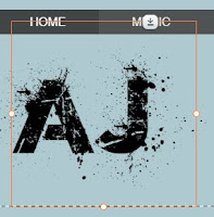
In addition to this the AJ logo was covering the Music button in the navigation which meant once the website was published the Music page couldn't be accessed. To fix this we had to resize and re-position the logo so that it wasn't overlapping.

Before: The Logo is covering the Music Button
After: No Overlap of the Logo
In our footer we have made sure to include copyright information, terms and conditions and also privacy policy information. These link to Atlantic Records pages as they are the parent company for our record label. In addition we have social media links as well.
Footer from the home page
Music Page
On our music page we had our music video at the top as it is the latest release for AJ and also his debut single. In addition to this we have a music player underneath which is set up to play all of the songs from the Disclosure album, as well as giving the opportunity for fans to buy not only the album but individual songs as well. 
The website is also designed to take you to PayPal when someone tries to buy a song/the album.
Tour Page
Our tour page contained all dates and venues for AJ's upcoming UK Arena Tour. Below is a screenshot of the table I made with the dates, venues, locations and ticket buttons. Each one of the 'Tickets' buttons takes the audience to the Ticketmaster homepage. 
About Page
The first thing that the viewer sees on our About page is a quote from NME magazine. NME is a British music journalism magazine and so this would appeal to audience members who have a strong interest in music. 
In addition to this we have included an interactive Q&A where fans can slide through a range of questions and read AJ's answers. This allows for the audience to get to know him better and build more of a connection with him and his music.
Gallery Page
Me editing the Gallery Page
The gallery page consists of photographs of AJ - promo shots and also some behind the scenes photos. There is also a behind the scenes video which allows for the audience to see exclusive content of what happened during the shoot and some fun bloopers.
Photos
Behind the scenes video
Shop Page
Me editing the Shop Page
On our shop page there are 12 products that fans can buy. From looking into other music artists we picked items that were commonly sold as merchandise and made sure to Photoshop the AJ logo onto each item. 
Our 12 items of merchandise
Once an item is clicked the viewer is taken to a page where they can choose the size and/or colour of the item and also read the product information and refund and return policy before adding the item to their cart. There is also a quick view option where you can choose size, colour and add to the cart without reading the extra information.
Quick View of Products
Detailed View with Extra Information
News Page
Our news page contains all of AJ's upcoming events, for example the UK Arena Tour and a radio appearance. Below is a photo of some of the events on the news page. 

Events on the News Page of the website
The competition has a read more button which when pressed takes you to the page below
We found that this was interactive for the fans as they could get involved directly and also get the opportunity win something. We also have it sponsored by JD Sports as we felt that a British clothing company would be most likely to sponsor AJ as most of his fans are also in JD Sports target audience of teenagers and young adults. 

At the bottom of the page we also have a subscribe option where fans can enter their email address and stay up to date with all of AJ's latest news.
Subscription option
Audience Feedback
We received positive feedback about our website. Some key points have been mentioned below
  • People really liked the different backgrounds on each page and felt the photographs were all really good quality 
  • The behind the scenes video was enjoyable to watch
  • The clear colour scheme of black, white, greys and blues was consistent and looked good.
  • They really liked how the ticket buttons took you to Ticketmaster and the shopping options took you to PayPal
  • In addition they liked the range of merchandise available and said it was very realistic
  • Overall the website seemed easy to use, clear and accessible as well as being interactive for the users
Ultimately, I am very pleased with how our website turned out especially because we started from scratch on a software we had never used before. I feel that it looks very professional and I think that it acts as a hub for all of our products and information successfully.